1钩子
日本の駅名なのに、英語アナウンスになると急にネイティブ化する謎すぎるw. 用「日本车站却突然变地道英语」的反差加「谜すぎるw」自嘲,让人忍不住想知道原因而点开。
- 内容
- 日本の駅名なのに、/ 英語アナウンスになると / 急にネイティブ化する謎すぎるw
- 位置
- 画面上方居中,占约七成宽度
- 字形
- 手写风粗体,第一行棕色,第二行玫红,第三行深棕
- 装饰
- 左上粉色放射线,右侧蓝色短线和红色问号
把封面放到灯下。它能火的五个原因,每一个都是一层,可以单独打开:文字、它用的网格、配色、主体和光线。
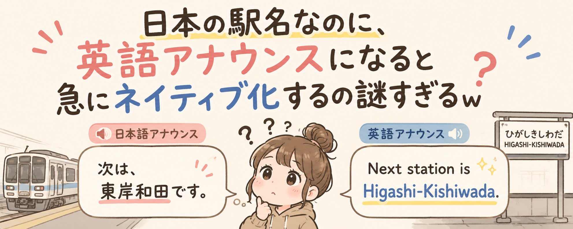
日本の駅名なのに、英語アナウンスになると急にネイティブ化する謎すぎるw. 用「日本车站却突然变地道英语」的反差加「谜すぎるw」自嘲,让人忍不住想知道原因而点开。
非本平台数值
由 ももなっち🍑 于 2026年5月9日发布在公众号封面。已注明作者并附原帖链接。
一字未改。直接复制,或者让 Queenie 换成你自己的内容。
请基于参考封面的构图、视觉隐喻和公众号缩略图可读性,生成一张新的微信公众号横版封面。 输出尺寸:1456x582,比例约 2.5:1;核心主体和必要标题信息要兼顾公众号安全方形裁切。 公众号文章标题:{填写公众号文章标题} 简介:{填写简介} 原封面方法:为什么日本车站广播中的地名突然变成了地道的英语发音风格双技能 Create a horizontal WeChat public-account article cover, 2.35:1 aspect ratio, for an article titled "为什么日本车站广播中的地名突然变成了地道的英语发音". Central concept: 围绕“为什么日本车站广播中的地名突…”提炼一个单一视觉隐喻,避免把全文信息塞进画面。 Style: preserve the reference cover's visual direction: 黑白或低饱和 editorial 插画/照片. Use a palette inspired by #fdf5ea (white), #fcf4e9 (white), #9b857b (gray), #dbcbbf (cream). Keep the image editorial, conceptual, and readable as a small WeChat thumbnail. Composition: 画面信息量较高,适合用中心主体加左右辅助信息,保持缩略图可读。 Keep the main subject and any essential title text inside the safe square crop, while using the full wide frame for atmosphere, secondary symbols, or directional motion. Text strategy: use either no text or a very short headline fragment from the title. If text is used, make it large, clean, and integrated into the layout rather than pasted on top. Mood: match the article skill "为什么日本车站广播中的地名突然变成了地道的英…风格双技能" -- useful, sharp, high-signal, and slightly more memorable than a normal tutorial thumbnail. Avoid: photorealistic clutter unless the source cover is photo-led, fake logos, unreadable tiny text, generic gradient blobs, stock-office imagery, watermark-like marks, and literal screenshots unless the article is explicitly about software interfaces.