1钩子
こんなん / フライ / ツライ. 手写日文菜单与价格牌并排出现,制造小酒馆的现场感,让人想看清写了什么。
- 文字内容
- こんなん / フライ / ツライ 等手写日文
- 位置
- 画面左上方与上方成排竖排
- 字号
- 中等,字距宽松
- 颜色
- 墨黑与朱红
把封面放到灯下。它能火的五个原因,每一个都是一层,可以单独打开:文字、它用的网格、配色、主体和光线。
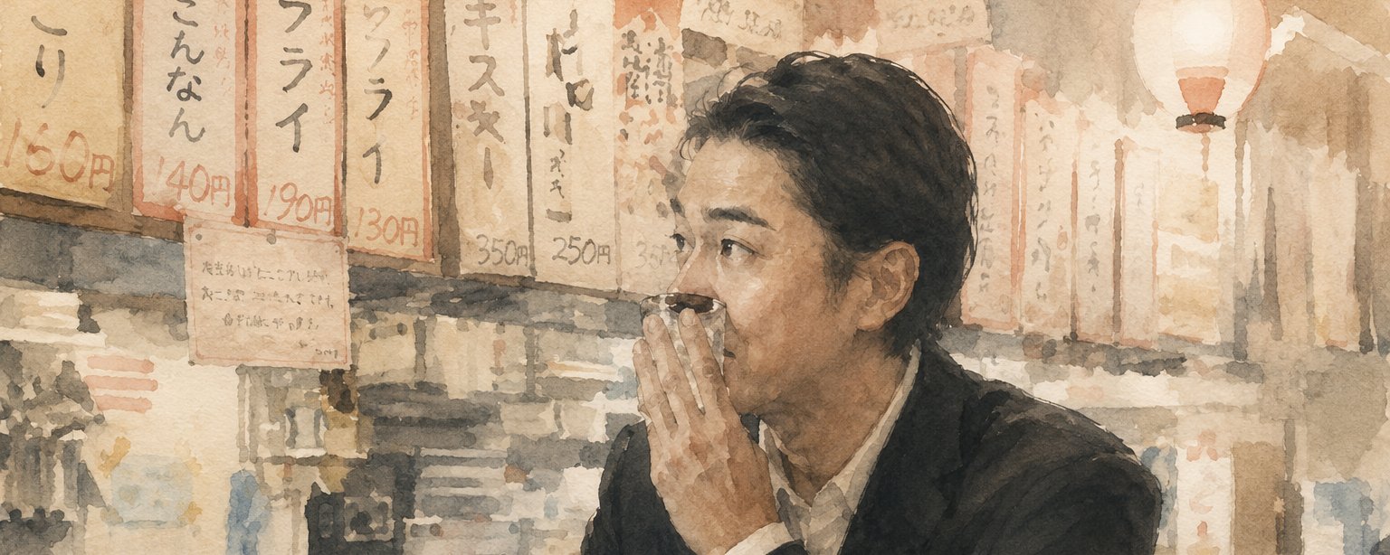
こんなん / フライ / ツライ. 手写日文菜单与价格牌并排出现,制造小酒馆的现场感,让人想看清写了什么。
非本平台数值
由 おりょん@yayo_1coaching 于 2026年5月12日发布在公众号封面。已注明作者并附原帖链接。
一字未改。直接复制,或者让 Queenie 换成你自己的内容。
请基于参考封面的构图、视觉隐喻和公众号缩略图可读性,生成一张新的微信公众号横版封面。 输出尺寸:1456x582,比例约 2.5:1;核心主体和必要标题信息要兼顾公众号安全方形裁切。 公众号文章标题:{填写公众号文章标题} 简介:{填写简介} 原封面方法:为什么女性会被东出昌大吸引:立吞酒馆里的40分钟风格双技能 Create a horizontal WeChat public-account article cover, 2.35:1 aspect ratio, for an article titled "为什么女性会被东出昌大吸引:立吞酒馆里的 40 分钟". Central concept: 把创作流程可视化为画布、素材板、镜头轨道、提示词卡片和成片预览。 Style: preserve the reference cover's visual direction: 细节密集的拼贴/界面/图表视觉. Use a palette inspired by #d5b898 (cream), #e2c8a9 (cream), #5c5042 (brown), #a28e76 (gray). Keep the image editorial, conceptual, and readable as a small WeChat thumbnail. Composition: 画面信息量较高,适合用中心主体加左右辅助信息,保持缩略图可读。 Keep the main subject and any essential title text inside the safe square crop, while using the full wide frame for atmosphere, secondary symbols, or directional motion. Text strategy: use either no text or a very short headline fragment from the title. If text is used, make it large, clean, and integrated into the layout rather than pasted on top. Mood: match the article skill "为什么女性会被东出昌大吸引立吞酒馆里的40分…风格双技能" -- useful, sharp, high-signal, and slightly more memorable than a normal tutorial thumbnail. Avoid: photorealistic clutter unless the source cover is photo-led, fake logos, unreadable tiny text, generic gradient blobs, stock-office imagery, watermark-like marks, and literal screenshots unless the article is explicitly about software interfaces.