AI tools · WeChat cover · potential 98 · Machine-translated
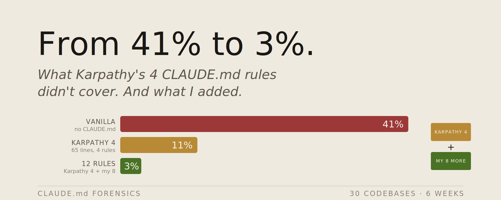
Karpathy's 4 CLAUDE.md rules cut Claude's error rate from 41% to 11%. After testing 30 codebases, I added 8 more
Put the cover under the lamp. Each of the five things that made it work is a layer you can switch on: the words, the grid it sits on, the colours it uses, the subject, the light.
Verbatim. Copy it, or let Queenie swap in your own details.
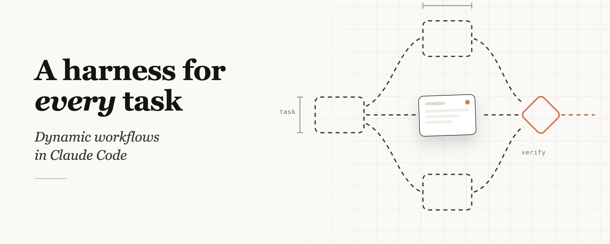
Please generate a new horizontal WeChat public-account cover based on the reference cover's composition, visual metaphor, and thumbnail readability for a public account. Output size: 1456x582, aspect ratio about 2.5:1; the core subject and necessary title information should also work within WeChat's safe square crop. Public account article title: {填写公众号文章标题} Intro: {填写简介} Original cover approach: Karpathy's 4 CLAUDE.md rules cut Claude's error rate from 41% to 11%. After testing 30 codebases, I added 8 more style dual-skill Create a horizontal WeChat public-account article cover, 2.35:1 aspect ratio, for an article titled "Karpathy's 4 CLAUDE.md rules cut Claude's error rate from 41% to 11%. After testing 30 codebases, I added 8 more". Central concept: visualize abstract tool capabilities as interface windows, code snippets, node networks, control panels, AI workflows, or a glowing system core. Style: preserve the reference cover's visual direction: light-background minimalist infographic/product slide. Use a palette inspired by #eeeadf (cream), #bfa999 (gray), #eeeade (cream), #f3efe5 (white). Keep the image editorial, conceptual, and readable as a small WeChat thumbnail. Composition: lots of whitespace, suitable for a large title, a few icons, and a clear left-text right-image/centered-title layout. Keep the main subject and any essential title text inside the safe square crop, while using the full wide frame for atmosphere, secondary symbols, or directional motion. Text strategy: use either no text or a very short headline fragment from the title. If text is used, make it large, clean, and integrated into the layout rather than pasted on top. Mood: match the article skill "Karpathy's 4 CLAUDEmd rules will... style dual-skill" -- useful, sharp, high-signal, and slightly more memorable than a normal tutorial thumbnail. Avoid: photorealistic clutter unless the source cover is photo-led, fake logos, unreadable tiny text, generic gradient blobs, stock-office imagery, watermark-like marks, and literal screenshots unless the article is explicitly about software interfaces.