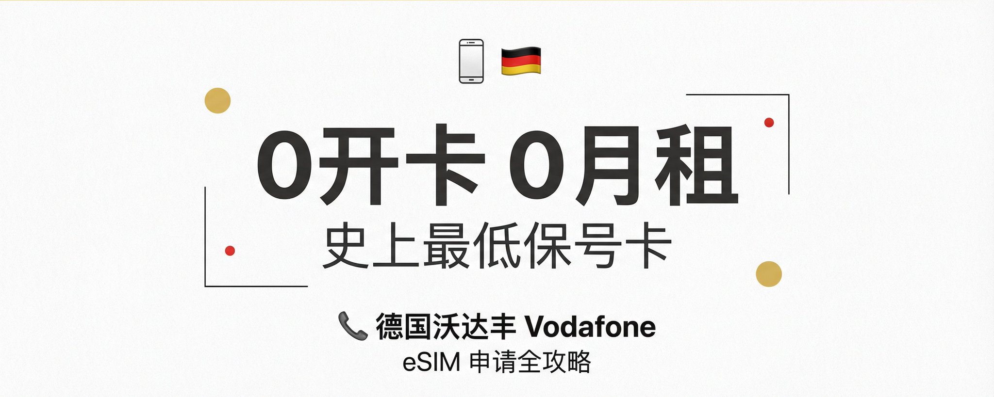
Only 10 RMB per year! Complete Guide to Netherlands Vodafone eSIM: The Ultimate International Number Without KYC
Put the cover under the lamp. Each of the five things that made it work is a layer you can switch on: the words, the grid it sits on, the colours it uses, the subject, the light.
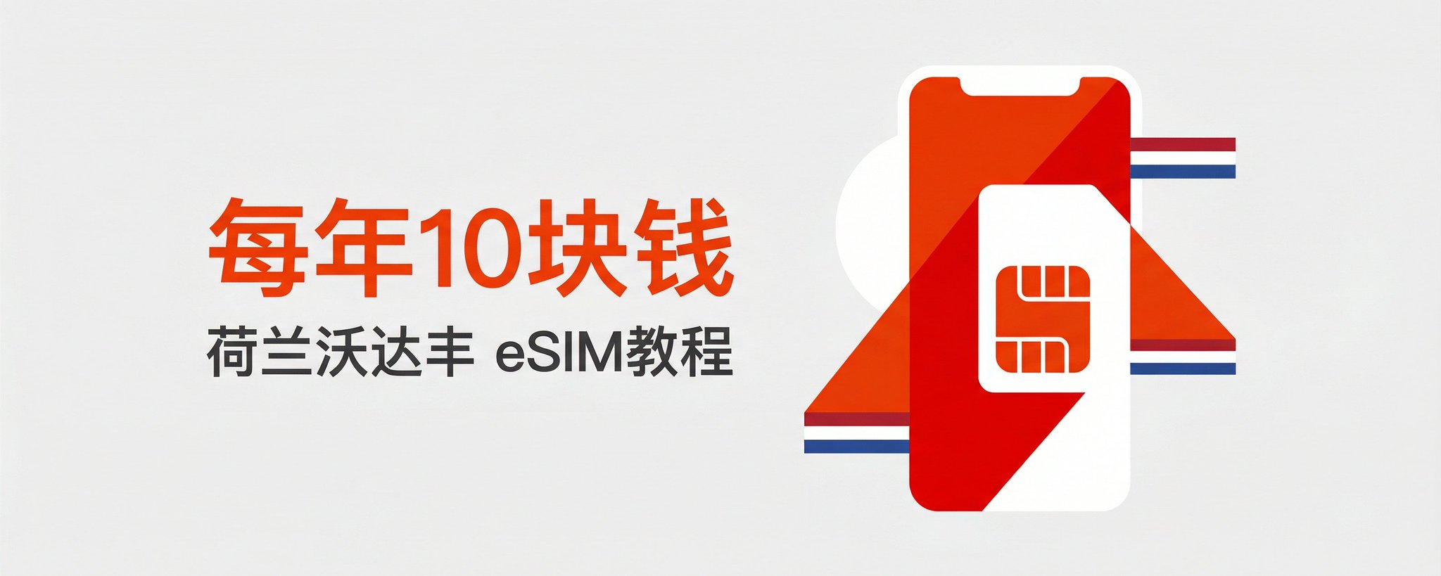
每年10块钱 / 荷兰沃达丰 eSIM教程. Use the extremely low price of "10 RMB a year" to create contrast, making readers immediately curious with "how is that possible?".
Main title
10 yuan a year
Subtitle
Netherlands Vodafone eSIM tutorial
Position
Left side, vertically centered
Font color and size
Large orange text + small dark gray text
♥ 3.6K likes★ 7.9K saves↗ 803 shares
Not from this platform
Posted by 鱼总聊AI on WeChat cover, 18 Jan 2026. Shown with credit and a link back.
Keep all five layers and swap what’s under them: your shop, your budget, your city. You get four covers and the post text.
Verbatim. Copy it, or let Queenie swap in your own details.
Please generate a new horizontal WeChat public-account cover based on the reference cover's composition, visual metaphor, and thumbnail readability. Output size: 1456x582, ratio about 2.5:1; the core subject and essential title information must also work within WeChat's safe square crop. Article title: {fill in the WeChat article title} Summary: {fill in the summary} Original cover method: Only 10 RMB per year! Complete Guide to Netherlands Vodafone eSIM: The Ultimate International Number Without KYC style dual skills Create a horizontal WeChat public-account article cover, 2.35:1 aspect ratio, for an article titled "Only 10 RMB per year! Complete Guide to Netherlands Vodafone eSIM: The Ultimate International Number Without KYC". Central concept: distill a single visual metaphor around "only 10 RMB per year Netherlands Vo...", avoiding cramming all the article information into the image. Style: preserve the reference cover's visual direction: black-and-white or low-saturation editorial illustration/photo. Use a palette inspired by #ededec (white), #ececec (white), #d46756 (orange), #f3f4f3 (white). Keep the image editorial, conceptual, and readable as a small WeChat thumbnail. Composition: lots of whitespace, suitable for a large headline, a few icons, and a clear left-text right-image/center-title layout. Keep the main subject and any essential title text inside the safe square crop, while using the full wide frame for atmosphere, secondary symbols, or directional motion. Text strategy: use either no text or a very short headline fragment from the title. If text is used, make it large, clean, and integrated into the layout rather than pasted on top. Mood: match the article skill "only 10 RMB per year Netherlands Vodafone eS... style dual skills" -- useful, sharp, high-signal, and slightly more memorable than a normal tutorial thumbnail. Avoid: photorealistic clutter unless the source cover is photo-led, fake logos, unreadable tiny text, generic gradient blobs, stock-office imagery, watermark-like marks, and literal screenshots unless the article is explicitly about software interfaces.